RECREATE: OSS WEBSITE
UX/UI project
This project aims to recreate a school website that many students feel troubled to use. Currently the OSS website is an online open source platform created for design students in Nanyang Technological University. Design students use this platform to upload documentation of their design process and assignments.
PROBLEMS OF CURRENT SITE
Problem: Restriction in user-friendliness, flexibility in the user interface of OSS on the website and mobile.
The current website provided to students is not mobile friendly. Furthermore, there were features that were not useful to students.

SURVEY
Survey for students in design school in NTU
After discovering the problems we went down to assess the extent of the problems. This was done though face to face interviews as well as an online survey. This survey helped us understand the problems facde by students and the reasons for them to dislike the website.
Below are the online survey results presented.
FACE TO FACE INTERVIEW
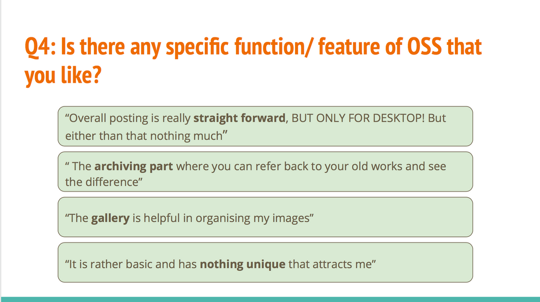
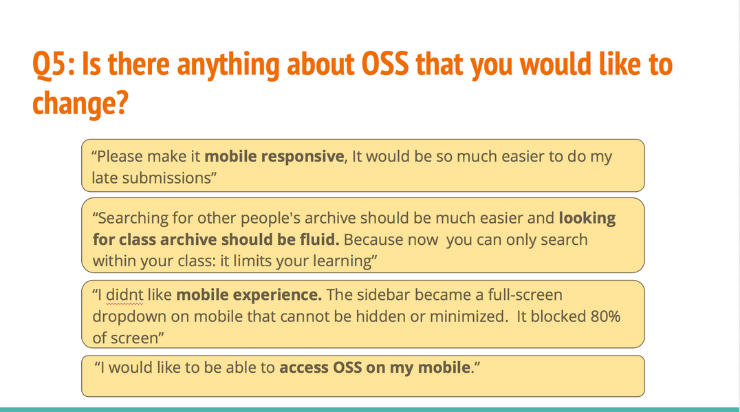
During our face to face interview, we asked design students a series of questions regagarding their experience with the current website. The below are he answers we received.

POST SURVEY PLANS
After surveys and interviews we narrowed down the main problems the current website was facing. The problems were that the current website was not mobile-friendly, inconveinvent to use and boring. Many students will not use it as a portfolio and felt that they were forced to use the website as it was used for grading. Therefore, after the surveys and interviews we concluded the main goals of our new application and they were:
1) increase uniqeness of OSS
2) Increase convenience
3) increase user-friendliness by making application mobile responsive.
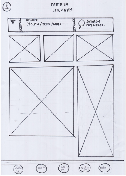
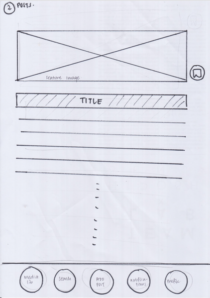
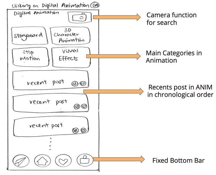
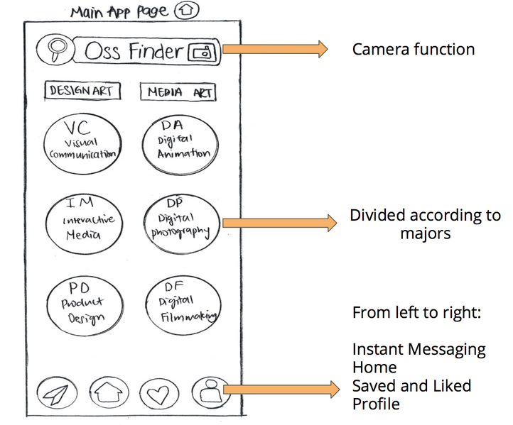
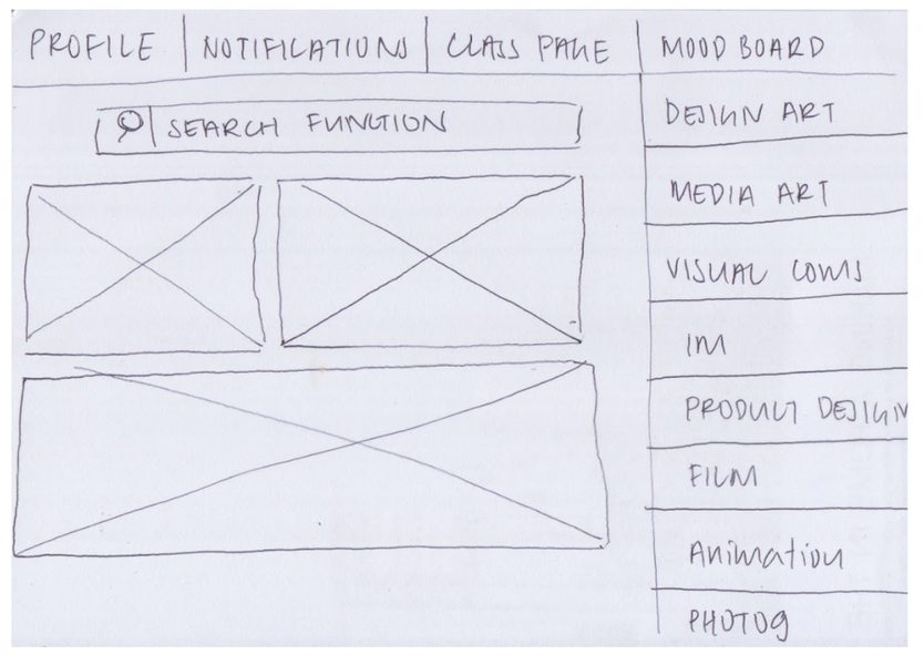
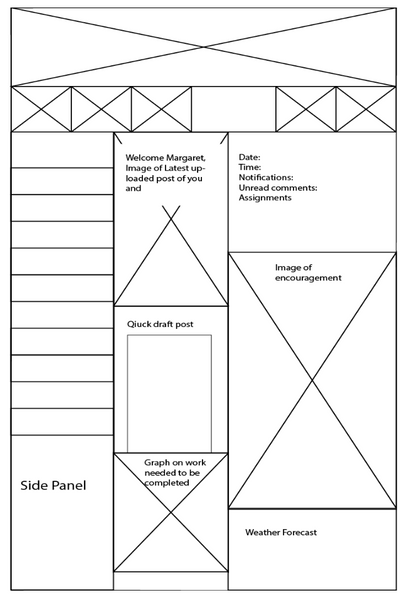
Below are screenshots of a few of the low fidelity sketch up on how we envisioned the project to look like
ONBOARDING EXPERIENCE
After the low fidelity sketch up we used Adobe XD to create another low fidelity prototype just to test the user experience and the flow of the mobile application. From the feedback we created the onboarding experience of of the application. We wanted the onboardng expereince to be for the current students as they will need to adapt to the new system.
For the onboarding experience we used simple illustrations to show the new features in the applications. We also chose the color scheme such that it will be neutral for all genders. The vector illustrations were derived from simple shapes. This is because we wanted to use a minimalism aesthetic to the application.
FINAL PROTOTYPE
After the low fidelity sketch up we used Adobe XD to create another low fidelity prototype just to test the user experience and the flow of the mobile application. From the feedback we created the onboarding experience of of the application.
Click button to try the application on computer
FINAL PROTOYPE
Please feel free to scan the QR code on your phones and use the application via your phones.


